

Mastering CSS Media Queries: A Practical Guide
A Hands-On Guide for Proficiency in Responsive Web Design

A Front-end Engineer and Technical Writer
Crafting a responsive and visually appealing user interface has become a paramount challenge in the dynamic realm of web development, where diverse devices and screen sizes are rising.
Cascading Style Sheets (CSS) Media Queries is the linchpin for responsive design, enabling websites to adjust to various devices. Mastering these queries is the key to ensuring an optimal user experience across desktops, tablets, and smartphones.
The art and science behind CSS Media Queries are unveiled in this practical guide, revealing the potential to create websites that transcend the limitations of static design and embrace the fluidity demanded by the modern digital age.
Let's get started.
Prerequisite
Basic understanding of web development (HTML and CSS concepts)
Fundamental understanding of Cascading Style Sheets (CSS)
Basic understanding of web browsers and their development tools
What are Media Queries?
Developers use these queries to apply CSS styles based on conditions like screen width, height, resolution, and orientation, ensuring an optimized user experience.
In essence, media queries make layouts flexible by adjusting the content for the user's device. For instance, a website might employ distinct layouts and font sizes for desktop computers and mobile phones, guaranteeing an optimal viewing experience on each device.
Media queries are defined using the @media rule in CSS, typically placed beneath the primary styles in the CSS file.
Here's a simple media query syntax:
@media media-type and (media-feature-rule) {
  /* CSS rules go here */
}
This example consists of
Media type, specifying the intended media for which the CSS code is, informing the browser how to apply the styles (for example
printfor print media andscreenfor display screens).Media feature, a rule that is required to apply the contained CSS rules.
Set of CSS rules that will take effect once the media type and media feature rules have been passed.
Media types
CSS media types serve the purpose of specifying distinct styles for various devices or media. Common media types include:
allapplies to all devices.@media all { /* CSS rules for all devices */ }printapplies when printing a document from a webpage.@media print { /* CSS rules for print */ }screenapplies to a specific screen resolution, such as smartphones, tablets, and computers.@media screen { /* CSS rules for screen display */ }
Media feature rules
In CSS, a media feature rule enables the application of styles based on specific features or attributes of the user's device. After determining the media type, the media feature rule comes in next.
These rules become part of media queries, adjusting content presentation to match specific characteristics.
Media queries use various media feature rules, but many new features have limited browser support.
The most commonly used media features include:
widthheightorientationhover(for pointing devices)
Width and Height
By utilizing the width and height features, developers can craft responsive designs, tailoring styles to the dimensions of the user's device, ensuring an optimal presentation across a range of screen sizes.
For example, to change the background and text color for a screen width of exactly 600px, the following media query is used:
@media screen and (width: 600px) {
     body {
    background-color: steelblue;
      color: white;
    }
}
The media features for width (and height) can function within ranges, allowing the use of prefixes such as min- or max- to signify whether the specified value is a minimum or a maximum.
For example, to make the background color red for screen sizes of 600px and below, use max-width:
@media screen and (max-width: 600px) {
  body {
    background-color: red;
  }
}
In responsive design, it's more practical to use minimum or maximum values with width or height – using width or height alone is rare in practice.
Orientation
The CSS media feature orientation is utilized to apply styles based on the user's device's orientation, whether in landscape or portrait mode. Here's an example:
/*For Landscape Mode*/
@media screen and (orientation: landscape) {
  body {
     background-color: gray;
  }
}

/*For Portrait Mode*/
@media screen and (orientation: portrait) {
   body {
     background-color: coral;
  }
}
In the initial media query from the example above, styles are implemented when the device is in landscape mode, altering the background color to gray. In the second media query, styles are applied when the device is in portrait mode, changing the background color to coral.
This feature is useful for adapting the layout or appearance of a webpage based on how the user is holding their device.
It's commonly used in responsive design to ensure a seamless and visually pleasing experience across different device orientations.
Hover (for pointing devices)
The hover media feature was recently introduced in January 2022, with the Media Queries Level 4 specifications.
The hover feature allows developers to apply styles based on the presence or absence of hover capability, making it useful for creating responsive designs that adapt to different types of devices. Devices such as touch screens or keyboard navigation do not hover.
Here is an example:
@media (hover: hover) {
  /* CSS rules applied when the device supports hover, like a mouse pointer */
  button:hover {
    background-color: lightgray;
    color: darkgray;
  }
}
In this example, the styles within the media query are implemented exclusively when the device supports hover, signifying the presence of a mouse or a comparable input device.
Advanced Media Queries
Advanced CSS media queries offer powerful tools for developers to customize styles based on diverse conditions and device features. Here are some examples:
The ‘and’ logic
In CSS media queries, the 'and' logic is used to combine multiple conditions. Styles inside the media query take effect only when all specified conditions are met.
Here is an example:
@media screen and (max-width: 600px) and (orientation: landscape) {
  body {
     background-color: gray;
  }
}
In this example, the and logic combines the screen media type, max-width, and orientation. The background color will become gray only when the device meets the specified conditions in the media query.
The ‘or’ logic
The ‘or’ logic is not explicitly used in the same way as ‘and’ logic. Instead, multiple conditions are implicitly treated as an ‘or’ statement. Styles within the media query are applied if any of the specified conditions are met. The 'or' is denoted by a comma.
For example:
@media screen and (max-width: 600px), screen and (orientation: portrait) {
  body {
     background-color: green;
  }
}
In this case, the media query conditions are separated by a comma. If any of these conditions are met, the background color will be green.
Walkthrough: A Simple Responsive Layout
Here’s a step-by-step guide to mastering the fundamentals of crafting adaptable web designs using media queries and CSS.
Firstly, start by creating index.html and style.css text files. Open both files with any text editor and paste the following code:
<!DOCTYPE html>
<html lang="en">
  <head>
<!--Meta tags for brief description of web page to search engines-->
    <meta charset="UTF-8" />
    <meta http-equiv="X-UA-Compatible" content="IE=edge" />
    <meta name="viewport" content="width=device-width, initial-scale=1.0"/>
    <title>CSS Media Queries</title>
    <link rel="stylesheet" href="style.css" />
  </head>
  <body>
    <header>
      <h1>CSS Media Queries</h1>
    </header>
    <main>
      <section id="smartphone"><p>Smartphones</p></section>
      <section id="tablet"><p>Tablet</p></section>
      <section id="widescreen"><p>Widescreen</p></section>
    </main>
  </body>
  </html>
Here is the initial CSS, styling up the body and main sections while resetting the margin, padding, and box-sizing:
* {
  padding: 0;
  margin: 0;
  box-sizing: border-box;
}

html, body {
  font-family: Poppins, sans-serif;
  min-height: 100vh;
  display: grid;
  grid-template-rows: auto 1fr;
}

header {
  background-color: #333;
  color: #fff;
}

header h1 {
  font-size: 2.5rem;
  font-weight: 100;
  padding: 2rem;
  text-align: center;
}

main {
  display: flex;
  flex-wrap: nowrap;
  justify-content: center;
}

main section {
  flex: 1 1 33.3vw;
  font-size: 2rem;
  font-weight: 300;
  display: grid;
  place-items: center;
  transition: flex-basis 0.8s ease-in;
}

p {
  padding: 1rem;
  font-size: 1rem;
}
Styling the layouts with specific IDs:
#smartphone {
  background-color: #ff5e5b;
  color: #fff;
}

#tablet {
  background-color: #ffed66;
  color: #333;
}

#widescreen {
  background-color: teal;
  color: #fff;
}
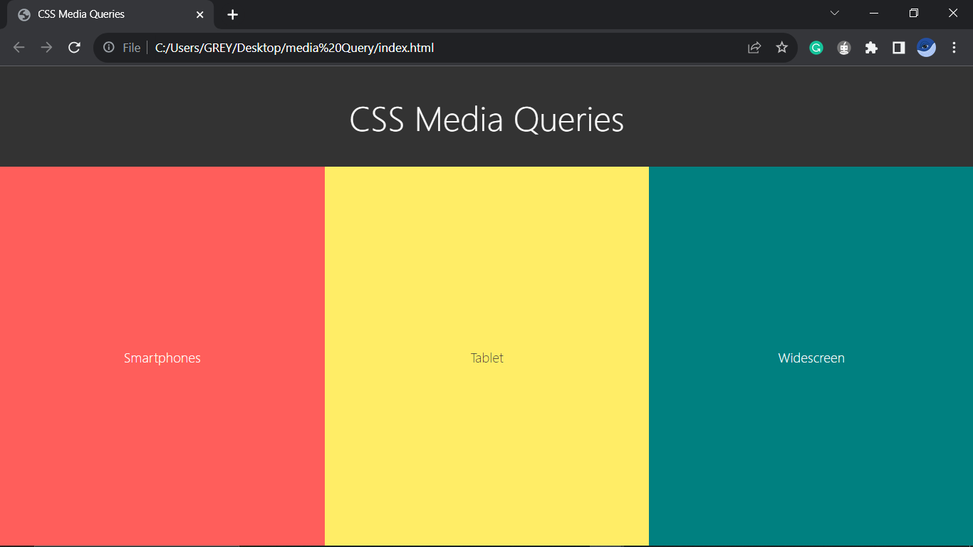
Save and open the index.html file with a browser (Google Chrome or Mozilla Firefox).
Here’s the result:
Add a media query for smartphones at the bottom of the style.css file:
/* For Smartphones */
@media screen and (max-width: 500px) {
  main section {
    flex-basis: 1rem;
  }

  #smartphone {
    flex-basis: 60vw;
  }

  #smartphone p {
    font-size: 2.5rem;
  }

  #tablet p, #widescreen p {
    writing-mode: vertical-rl;
    text-orientation: sideways;
  }
}
Save and add a media query for tablets and screens a bit wider than smartphones:
/* For Tablet */
@media screen and (min-width: 501px) and (max-width: 769px) {
  main section {
    flex-basis: 1rem;
  }

  #tablet {
    flex-basis: 60vw;
  }

  #tablet p {
    font-size: 5rem;
  }

  #smartphone p, #widescreen p {
    writing-mode: vertical-rl;
    text-orientation: sideways;
  }
}
Save and add the last media query for widescreens:
/* For Widescreens (PC etc) */
@media screen and (min-width: 770px) {
  main section {
    flex-basis: 1rem;
  }

  #widescreen {
    flex-basis: 60vw;
  }

  #widescreen p {
    font-size: 7.5rem;
  }

  #smartphone p, #tablet p {
    writing-mode: vertical-rl;
    text-orientation: sideways;
  }
}
Save and reload the web page to get this result:
It adjusts to whatever device you're reading this article on. However, you can change the screen size by selecting the 1x, 0.5x, and 0.25x options at the bottom right corner.
Now, the web page is entirely responsive, dynamically adjusting its display to accommodate the specific device type being used to access it.
The webpage showcases distinct content for different devices: it presents "Smartphones" for widths of 500px or narrower, "Tablet" for screen sizes ranging from 501px to 769px, and "Widescreen" for devices with a width of 770px and above.
Why use Media Queries
It is a key tool for developing responsive designs that adjust to various screen sizes and orientations. They play a crucial role in ensuring a consistent and user-friendly experience across a range of devices, including desktops and smartphones.
Media queries optimize content presentation by adjusting styles based on device features like width, height, or resolution thereby enhancing readability, usability, and user satisfaction.
Styles tailored for printed documents are supported by media queries, ensuring proper formatting and readability when a web page is printed by users.
Testing and Debugging
Ensuring the proper functioning of a responsive design across diverse devices requires critical testing and debugging of media queries.
The most popular method for testing and debugging media is the use of Browser Developer Tools. Browsers like Chrome, Firefox, or Safari can simulate different devices and screen sizes to see how the styles respond.
Use the command Ctrl + Shift + I or F12 as a shortcut to open developer tools and Ctrl + Shift + M to toggle the Device Toolbar for Google Chrome, Mozilla Firefox, Microsoft Edge, and Opera browsers on Windows.
Use the command Cmd + Option + I as a shortcut to open developer tools and Cmd + Option+ M to toggle the Device Toolbar for Google Chrome, Mozilla Firefox, and Opera browsers on MacOS (and Cmd + Option + C for safari developer tools).
Conclusion
In summary, mastering CSS media queries is vital for responsive web design, enabling developers to customize styles for diverse devices. Testing and debugging ensure seamless performance on smartphones, tablets, and widescreen devices. With media queries' precision, developers navigate the digital landscape, delivering visually appealing content across a range of devices.
Additional Resources
Happy coding!


